想要实现类似于这样:
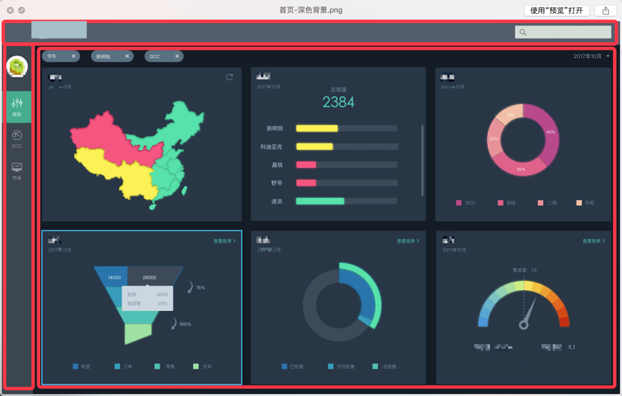
的后台页面布局效果:
顶部Header + 左边边栏 + 下面内容区域
而基于模板:
https://github.com/PanJiaChen/vueAdmin-template/tree/permission-control
现在的布局已有的是:
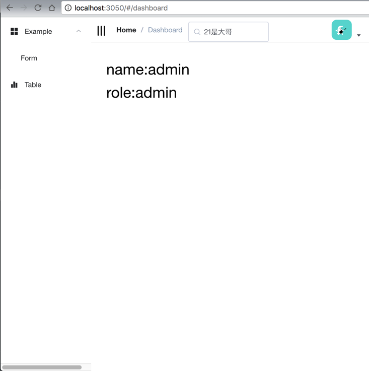
是左边变量到顶的,且没有Header,不太符合要求。
所以去研究如何整合布局。
参考:
找到了我要的:
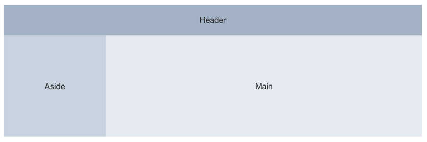
代码为:
<el-container> <el-header>Header</el-header> <el-container> <el-aside width=”200px”>Aside</el-aside> <el-main>Main</el-main> </el-container> </el-container> |
去试试。
【总结】
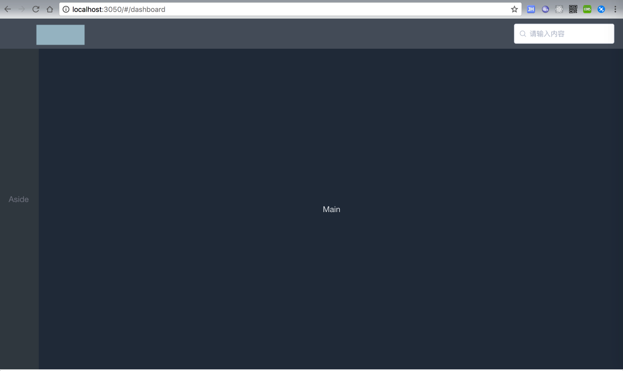
最后调试了半天,尤其是Header中的Image图片的垂直居中,然后基板上得到了想要的效果:
代码:
<template> <el-container> <el-header> <div class=”header_logo”> <img :src=”header_logo_img” alt=”skoda logo”> </div> <div class=”header_search”> <el-input placeholder=”请输入内容” prefix-icon=”el-icon-search” > </el-input> </div> </el-header> <el-container> <el-aside width=”80px”>Aside</el-aside> <el-main>Main</el-main> </el-container> </el-container> </template> <script> import { Navbar, Sidebar, AppMain } from ‘@/views/layout’ import header_logo_img from ‘@/assets/skoda_logo_dark.jpg’ export default { name: ‘layout’, components: { Navbar, Sidebar, AppMain }, data() { return { header_logo_img } }, computed: { sidebar() { return this.$store.state.app.sidebar } } } </script> <style rel=”stylesheet/scss” lang=”scss” scoped> .el-header{ background-color: #545E6A; color: #F6F6F6; line-height: 60px; display: flex; justify-content: center; align-items: center; } .header_row { height: 60px; } .el-aside { background-color: #3D464F; color: #828692; text-align: center; line-height: 600px; } .el-main { background-color: #283647; color: #E6E8EA; text-align: center; line-height: 600px; } body > .el-container { margin-bottom: 40px; } .el-container:nth-child(5) .el-aside, .el-container:nth-child(6) .el-aside { line-height: 260px; } .el-container:nth-child(7) .el-aside { line-height: 320px; } .header_logo { flex: 3; display: flex; justify-content: left; margin-left: 60px; } .header_search { display: flex; float: right; width: 200px; } </style> |
效果:
当前还有很多缺点:
Header,Aside,Main等宽度和高度,未必能自动适配所有屏幕。待后续再去优化。
转载请注明:在路上 » 【已解决】vue中用Element-UI实现后台页面整体布局