之前已经弄好基本的网站主页了:
http://ip
头像大小没问题:
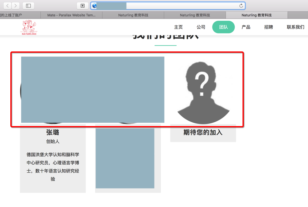
但是在移动端,看起来就很大,很突兀:
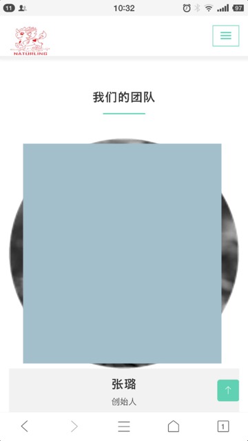
所以去想办法调整一下,在移动端的图片的大小
html5 mobile image size
html5 – What size should my images be for a mobile site – Stack Overflow
然后试了半天,发现:
bootstrap 3的img-responsive 应该就是和bootstrap 4的img-fluid都是:
.img-fluid{max-width:100%;height:auto}
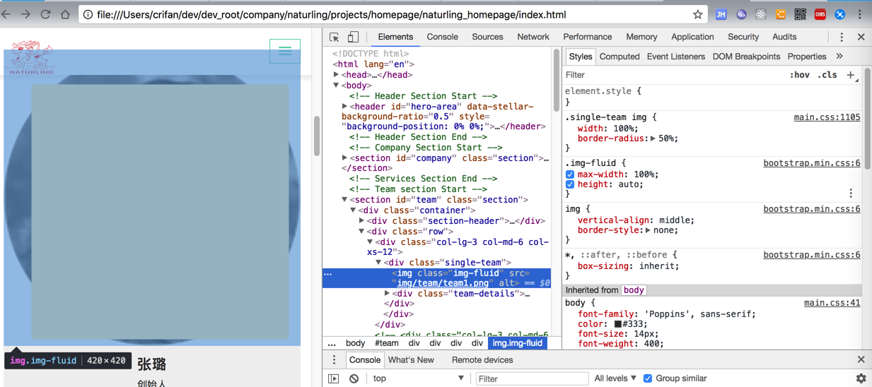
然后对于此处:
<img class="img-fluid" src="img/team/team1.png" alt="">
并没有什么效果:
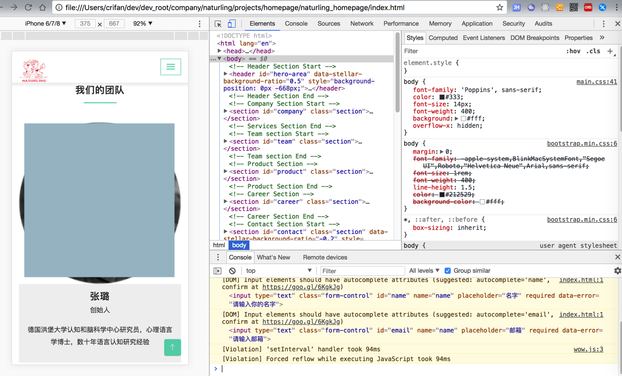
然后还是用screen去试试吧
代码:
.single-team img {
width: 100%;
border-radius: 50%;
}
@media screen and (max-width: 768px) {
.single-team img {
width: 60% !important;
}
}
效果:
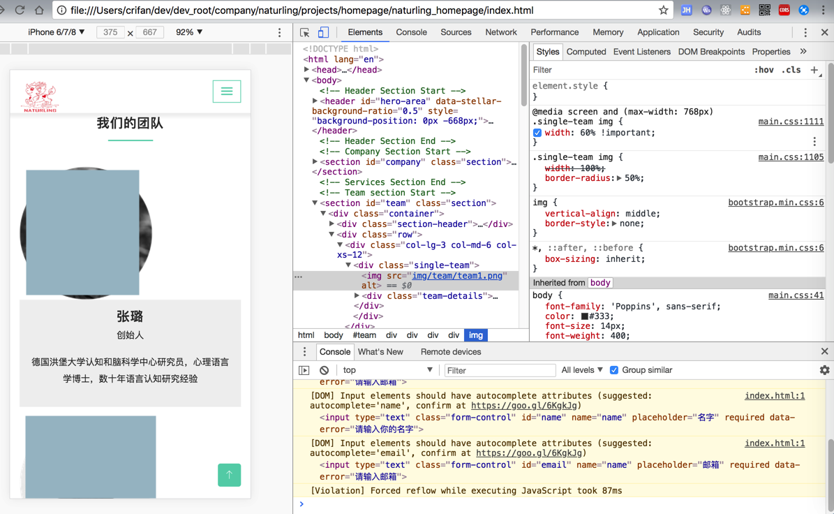
但是没有居中对齐
html5 image align center
去试试:img的align=middle
然后发现“The align attribute of <img> is not supported in HTML5. Use CSS instead.”
所以放弃。
并没有水平居中对齐的css
html5 – Left align, and center an inline image inside a container – Stack Overflow
【总结】
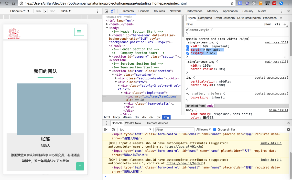
最后用代码:
.single-team img {
width: 100%;
border-radius: 50%;
}
@media screen and (max-width: 768px) {
.single-team img {
width: 60% !important;
margin:0px auto;
display:block;
}
}
效果是:
普通PC端:
正常:
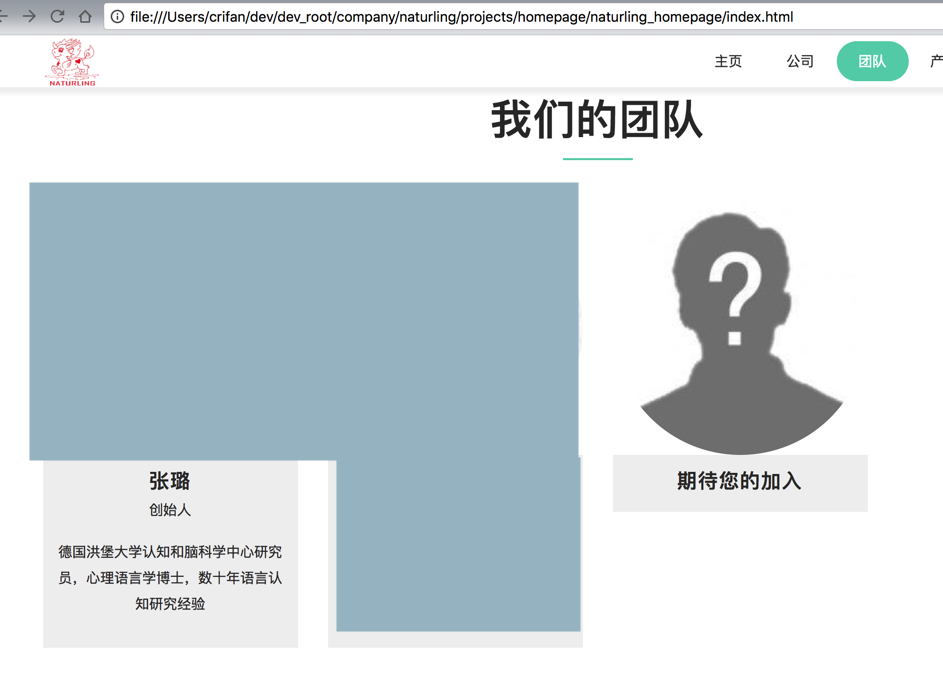
移动端:
(1)60%的大小
(2)可以水平居中
转载请注明:在路上 » 【已解决】把移动端显示的网站中头像变小一点