折腾:
【已解决】ReactJS中如何画左右叠加图的ECharts图表
已经写了基本的水平方向的柱状堆叠图:
代码:
let curEchartsOption = { tooltip : { trigger: ‘axis’, axisPointer : { // 坐标轴指示器,坐标轴触发有效 type : ‘shadow’ // 默认为直线,可选为:’line’ | ‘shadow’ } }, legend: { show: true, x: ‘left’, y: ‘bottom’, data: [ ‘DCC’, ‘电话’, ‘进店’, ‘外拓’, ‘二级网点’, ‘缺口’ ] }, grid: { left: ‘3%’, right: ‘4%’, bottom: ‘3%’, containLabel: false }, xAxis: { type: ‘value’, // data: [49, 4, 12, 26, 25, 0] }, yAxis: { show: false, type: ‘category’, //data: [‘周一’,’周二’,’周三’,’周四’,’周五’,’周六’,’周日’] // data: [‘周一’] data: [] }, series: [ { name: ‘DCC’, type: ‘bar’, stack: ‘总量’, label: { normal: { show: false, position: ‘insideRight’ } }, data: [49] }, { name: ‘电话’, type: ‘bar’, stack: ‘总量’, label: { normal: { show: false, position: ‘insideRight’ } }, data: [4] }, { name: ‘进店’, type: ‘bar’, stack: ‘总量’, label: { normal: { show: false, position: ‘insideRight’ } }, data: [12] }, { name: ‘外拓’, type: ‘bar’, stack: ‘总量’, label: { normal: { show: false, position: ‘insideRight’ } }, data: [26] }, { name: ‘二级网点’, type: ‘bar’, stack: ‘总量’, label: { normal: { show: false, position: ‘insideRight’ } }, data: [25] }, { name: ‘缺口’, type: ‘bar’, stack: ‘总量’, label: { normal: { show: false, position: ‘insideRight’ } }, data: [0] } ] }; |
效果:
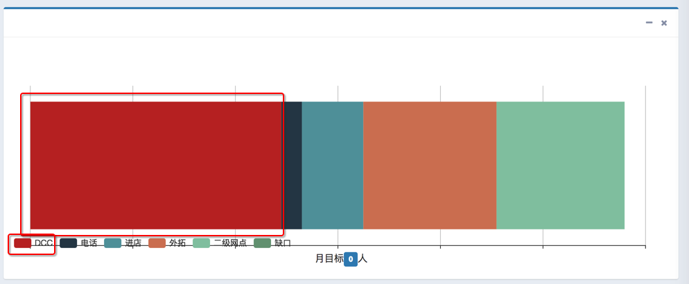
注意到:
DCC的legend图例说明的颜色,和x轴上堆叠图中数据的颜色,都是深红色,现在想要设置为:
export const ValueColor = { RED : ‘rgb(245, 105, 84)’, GRAY : ‘rgb(210, 214, 222)’, GREEN : ‘rgb(0, 166, 90)’, YELLOW : ‘rgb(243, 156, 18)’, LIGHT_BLUE : ‘rgb(0, 192, 239)’, DARK_BLUE : ‘rgb(60, 141, 188)’ }; |
深蓝色:DARK_BLUE
所以去参考官网:
http://echarts.baidu.com/option.html#series-bar.data.itemStyle.normal.color
去把:
data: [49]
改为:
data: [ { value: 49, label: {}, itemStyle: { normal: { color: ValueColor.DARK_BLUE } } } ] |
的确是可以改变数据中DCC的颜色了:
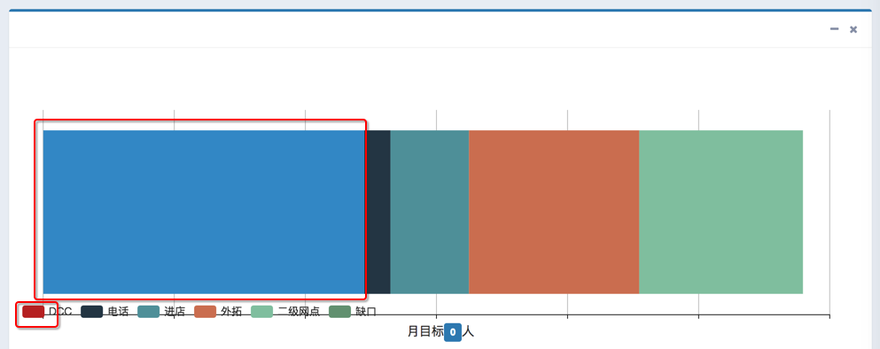
但是legend图例中却还是之前的深红色。
所以继续去找配置,找到了:
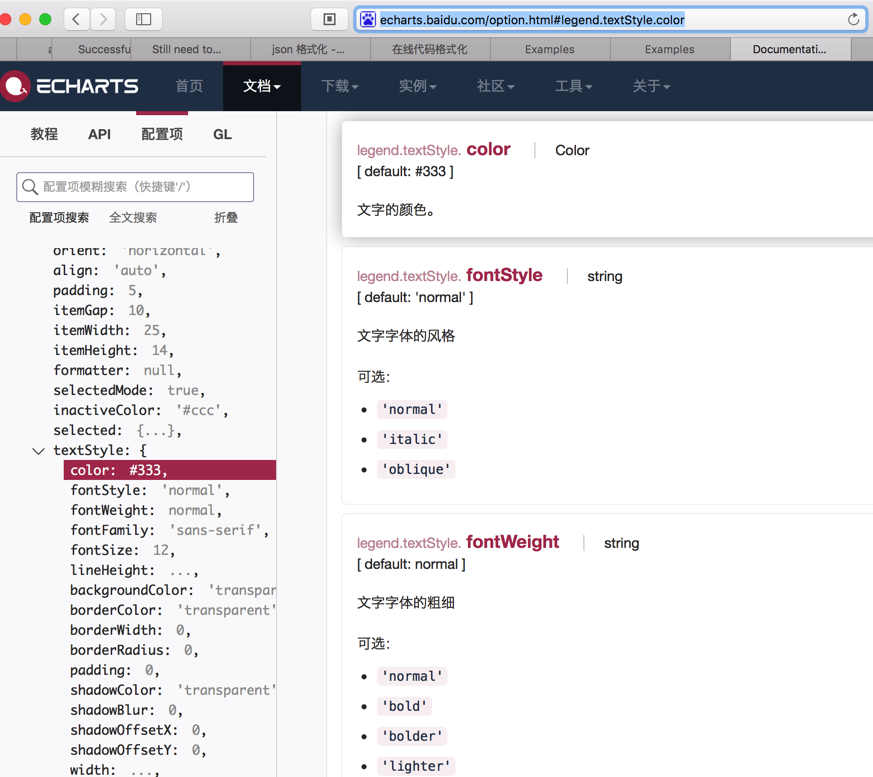
http://echarts.baidu.com/option.html#legend.data.textStyle
而对于textStyle中有什么属性,则是参考:
http://echarts.baidu.com/option.html#legend.textStyle.color
看到了其下有color等属性:
所以去设置:
把legend中data中’DCC’改为:
{ name: ‘DCC’, textStyle: { color: ValueColor.DARK_BLUE } }, |
结果是:
问题依旧,图例中颜色还没变。
然后自己研究,感觉到,估计是:
此处legend中的图例的颜色,是随着series中的data的颜色一起变化的,
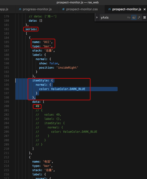
而series中的data颜色,如果是一位数组,则是直接就生效了,可以变过来的,但是此处是二维数组,而上面的设置DCC的data颜色,是针对于自己单独一个数字制定颜色的,而不是整个一位数组的颜色。
而series中单个的DCC所在的一位数组的颜色,通过之前无意间发现的:
http://echarts.baidu.com/option.html#series-bar.itemStyle.normal.color
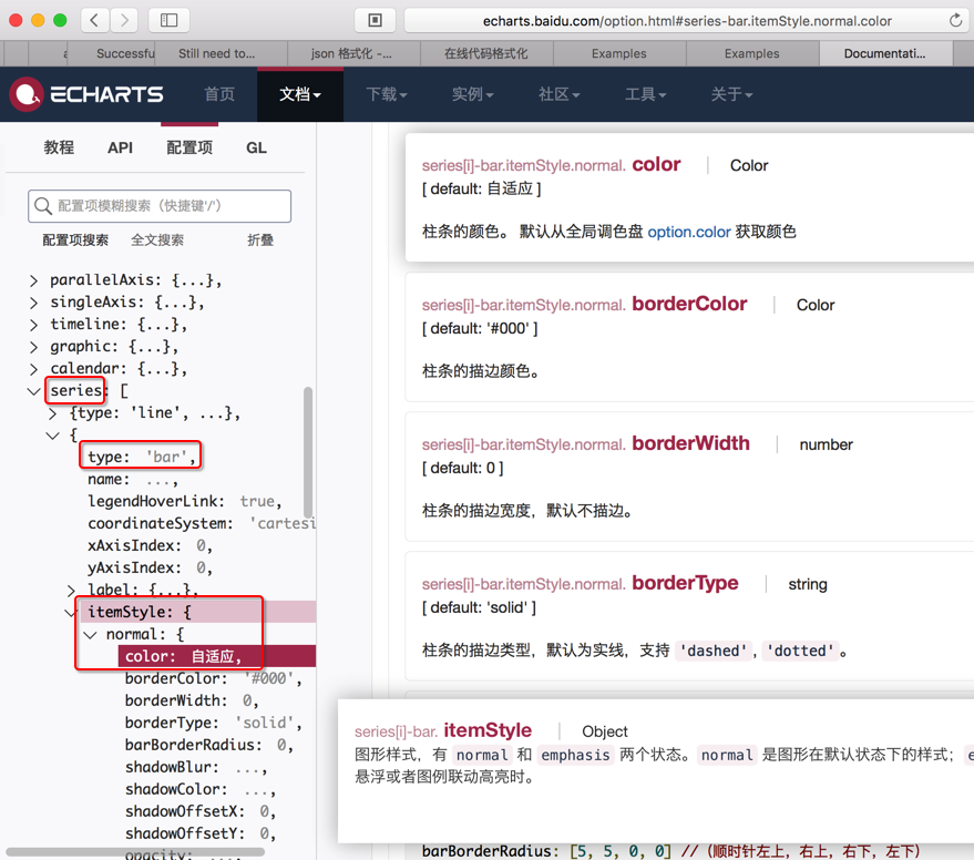
即通过series-bar.itemStyle.normal.color可以去设置。
所以去改为:
series: [ { name: ‘DCC’, type: ‘bar’, stack: ‘总量’, label: { normal: { show: false, position: ‘insideRight’ } }, itemStyle: { normal: { color: ValueColor.DARK_BLUE } }, data: [ 49 // { // value: 49, // label: {}, // itemStyle: { // normal: { // color: ValueColor.DARK_BLUE // } // } // } ] }, |
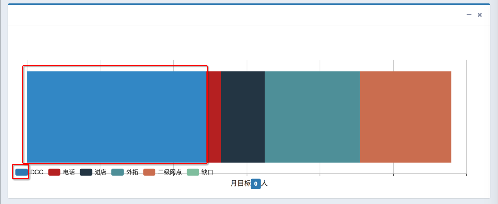
然后就生效了:
图例的颜色和数据的颜色一致了:
【总结】
最后,附上全部的配置:
let curEchartsOption = { tooltip : { trigger: ‘axis’, axisPointer : { // 坐标轴指示器,坐标轴触发有效 type : ‘shadow’ // 默认为直线,可选为:’line’ | ‘shadow’ } }, legend: { show: true, x: ‘left’, y: ‘bottom’, data: [ ‘DCC’, // { // name: ‘DCC’, // textStyle: { // color: ValueColor.DARK_BLUE // } // }, ‘电话’, ‘进店’, ‘外拓’, ‘二级网点’, ‘缺口’ ] }, grid: { left: ‘3%’, right: ‘4%’, bottom: ‘3%’, containLabel: false }, xAxis: { type: ‘value’, // data: [49, 4, 12, 26, 25, 0] }, yAxis: { show: false, type: ‘category’, //data: [‘周一’,’周二’,’周三’,’周四’,’周五’,’周六’,’周日’] // data: [‘周一’] data: [] }, series: [ { name: ‘DCC’, type: ‘bar’, stack: ‘总量’, label: { normal: { show: false, position: ‘insideRight’ } }, itemStyle: { normal: { color: ValueColor.DARK_BLUE } }, data: [ 49 // { // value: 49, // label: {}, // itemStyle: { // normal: { // color: ValueColor.DARK_BLUE // } // } // } ] }, { name: ‘电话’, type: ‘bar’, stack: ‘总量’, label: { normal: { show: false, position: ‘insideRight’ } }, data: [4] }, { name: ‘进店’, type: ‘bar’, stack: ‘总量’, label: { normal: { show: false, position: ‘insideRight’ } }, data: [12] }, { name: ‘外拓’, type: ‘bar’, stack: ‘总量’, label: { normal: { show: false, position: ‘insideRight’ } }, data: [26] }, { name: ‘二级网点’, type: ‘bar’, stack: ‘总量’, label: { normal: { show: false, position: ‘insideRight’ } }, data: [25] }, { name: ‘缺口’, type: ‘bar’, stack: ‘总量’, label: { normal: { show: false, position: ‘insideRight’ } }, data: [0] } ] }; |
供参考。