在一个Preact的ReactJS的项目中,用到了ECharts去显示一个饼图,但是显示内容左右两边有点缺失,显示不全:

原先相关的核心代码为:
main/index.js
import Pie from ‘../../components/pie’; 。。 <Pie data={newMainCowStatus}/> </div> |
src/components/pie/index.js
import { h, Component } from ‘preact’; import style from ‘./style.less’; import ReactEcharts from ‘echarts-for-react’; const pieStyle = { width: ‘4.8rem’, height: ‘4rem’, margin: ‘0.1rem auto’ }; function toPercent(num) { return parseFloat((num * 100).toFixed(2)) + ‘%’; } function getOtion(data) { const total = data.reduce((acc, item)=> acc + item.number, 0); return { series: [{ type: ‘pie’, radius: [‘0%’, ‘70%’], data: data.map(({ number, color }) => ({ value: number, name: total ? toPercent(number / total) : 0, itemStyle: { normal: { color } } })) }] }; } export default class Pie extends Component { render() { const { data } = this.props; return ( <div class={style.home_cake}> <ReactEcharts style={pieStyle} option={getOtion(data)} /> <div class={style.n_text}> <h2>牛群分布图</h2> { data.map(({text, color}) => { return ( <p><em style={{backgroundColor: color}} />{text}</p> ); }) } </div> </div> ); } } |
后面会贴上:
src/components/pie/style.less
用的库是:
"echarts-for-react": "^1.4.4", |
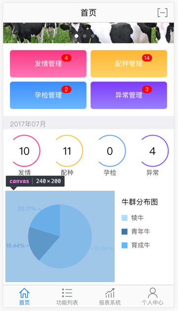
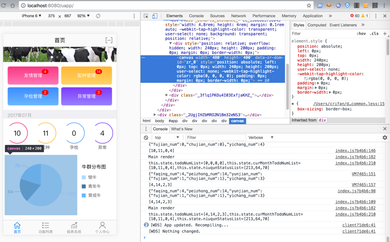
去调试看到canvas是 240×200
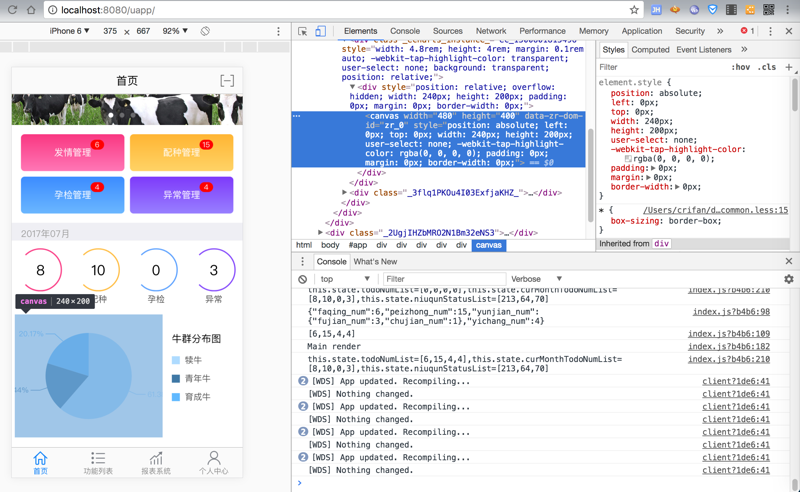
既然指定了宽和高,按照道理来说,数据显示就不应该超出对应的区域才对啊
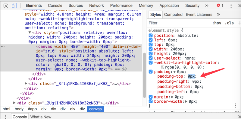
想要实时修改css属性去看看效果,结果还无法修改:
然后宽度可以修改,但是改为很窄,数据还是无法显示完全:
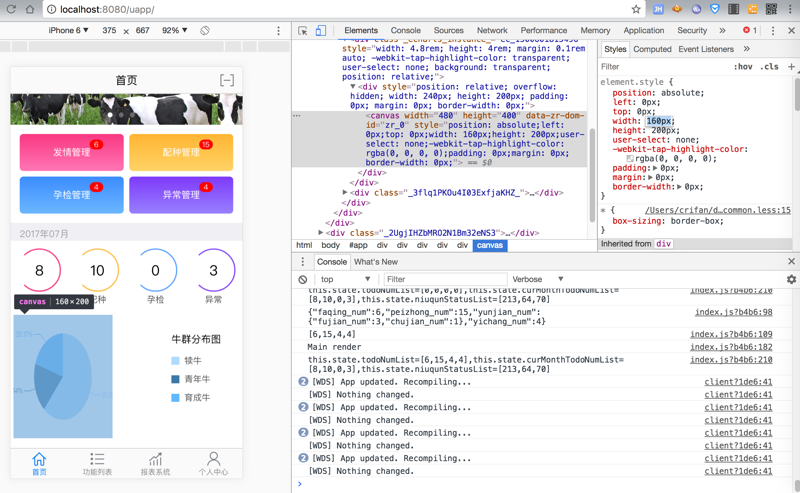
-》所以不是宽度不够的问题,而是,给定的宽度中,数据显示有问题,边上显示不全
reactjs echarts-for-react display
reactjs echarts-for-react not full display
react js echarts-for-react not full display
echarts-for-react
echarts-for-react 饼图
参考
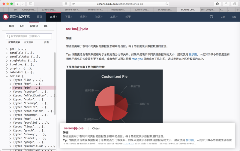
-》找到的官网的ECharts的饼图pie的配置参数:
中,发现和此处问题有关系的,其效果的是:
(1)如果这是把显示文字放在饼图内部,也可以避免数据超过显示区域的问题,但是有点空旷,视觉效果不是太好
参数:
type: ‘pie’, label : { normal : { position : "inside" } }, |
效果:
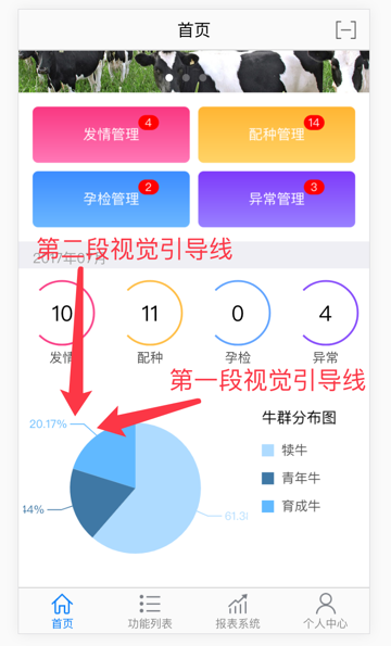
(2)控制“视觉引导线第一段”和“视觉引导项第二段”的长度,设置比较短,则可以很好的解决此问题:
参数代码:
type: ‘pie’, label : { normal : { position : "outside" } }, labelLine : { normal : { length : 5, length2 : 5 } }, |
其中:
length指的是:视觉引导线第一段 的长度
length2指的是:视觉引导线第二段 的长度
此处都设置为,比较短的5(个像素?)
默认好像是20(个像素)左右
效果:

其中可以看到,显示的数据,没有超过显示区域:
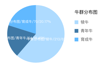
(3)其实可以控制显示的内容,除了百分比外,还包括数字
参数解释:
series[i]-pie.label.normal.formatter string, Function 标签内容格式器,支持字符串模板和回调函数两种形式,字符串模板与回调函数返回的字符串均支持用 \n 换行。 字符串模板 模板变量有 {a}、{b}、{c}、{d},分别表示系列名,数据名,数据值,百分比。 示例: formatter: ‘{b}: {d}’ |
代码:
type: ‘pie’, label : { normal : { position : "inside", formatter: ‘{c}/{d}%’ } }, labelLine : { normal : { length : 5, length2 : 5 } }, |
效果:
缺点:此处移动端的宽度就不够显示,又使得显示的数据超出显示区域了。所以此处设置为inside,在饼图内部显示。
另外试了试:
series: [{ type: ‘pie’, name : "牛群分布图", // roseType : "radius", // avoidLabelOverlap : true, label : { normal : { // show : true, // position : "outside", position : "inside", // formatter: ‘{c}/{d}%’ formatter: ‘{a}/{b}/{c}/{d}%’ } }, labelLine : { normal : { // show : true length : 5, length2 : 5 } }, //radius: [‘0%’, ‘70%’], radius: [‘0%’, ‘100%’], data: data.map(({ text, number, color }) => ({ value: number, //name: total ? toPercent(number / total) : 0, name : text, itemStyle: { normal: { color } } })) }] |
其中的data的text的定义在:
// 牛群状态 mainCowStatus: [{ text: ‘犊牛’, number: 0, color: ‘rgb(174,219,255)’ }, { text: ‘青年牛’, number: 0, color: ‘rgb(63,120,165)’ }, { text: ‘育成牛’, number: 0, color: ‘rgb(97,185,255)’ }], |
效果:
(4)其实也可以通过radius控制饼图(直径)大小,但是如果太小会不太好看
参数代码:
type: ‘pie’, label : { normal : { formatter: ‘{c}/{d}%’ } }, labelLine : { normal : { length : 5, length2 : 5 } }, //radius: [‘0%’, ‘70%’], radius: [‘0%’, ‘50%’], |
效果:

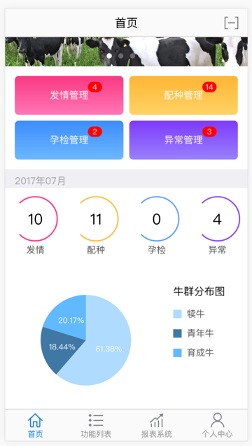
【总结】
此处,希望实现:
如果可以,尽量让饼图的数字和百分比都能显示出来
但是不要显示在饼图里面,显示在饼图外面。
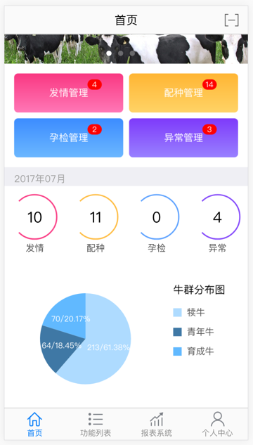
->后来又说:不要百分比的值了。只保留数字多少。
去调试和优化,最后代码是:
src/components/pie/index.js
import { h, Component } from ‘preact’; import style from ‘./style.less’; import ReactEcharts from ‘echarts-for-react’; const pieStyle = { width: ‘4.8rem’, height: ‘4rem’, margin: ‘0.1rem auto’ // margin: ‘0.4rem auto’ }; // function toPercent(num) { // return parseFloat((num * 100).toFixed(2)) + ‘%’; // } function getOtion(data) { // const total = data.reduce((acc, item)=> acc + item.number, 0); return { series: [{ type: ‘pie’, name : "牛群分布图", // roseType : "radius", // avoidLabelOverlap : true, label : { normal : { // show : true, position : "outside", // position : "inside", // formatter: ‘{a}/{b}/{c}/{d}%’ // formatter: ‘{b}/{c}/{d}%’ // formatter: ‘{c}/{d}%’ // formatter: ‘{c}/{d}’ // formatter: ‘{b}/{c}’ formatter: ‘{c}’, textStyle : { fontSize : 14 } } }, labelLine : { normal : { // show : true // length : 5, // length2 : 5 length : 10, length2 : 15 } }, radius: [‘0%’, ‘70%’], // radius: [‘0%’, ‘60%’], // radius: [‘0%’, ‘90%’], data: data.map(({ text, number, color }) => ({ value: number, //name: total ? toPercent(number / total) : 0, name : text, itemStyle: { normal: { color } } })) }] }; } export default class Pie extends Component { render() { const { data } = this.props; return ( <div class={style.home_cake}> <ReactEcharts style={pieStyle} option={getOtion(data)} /> <div class={style.n_text}> <h2>牛群分布图</h2> { data.map(({text, color}) => { return ( <p><em style={{backgroundColor: color}} />{text}</p> ); }) } </div> </div> ); } } |
src/components/pie/style.less
@import ‘~style/helpers’; .home_cake { position: relative; overflow: hidden; padding-right: 2.5rem; padding-bottom: 0.1rem; min-height: 4.8rem; background-color: #fff; } .home_cake .n_text { .noUserSelect; position: absolute; top: 0.5rem; left: 5.2rem; } .home_cake .n_text h2 { line-height: 0.78rem; font-size: 0.32rem; color: #000; } .home_cake .n_text p { padding-left: 0.42rem; height: 0.6rem; line-height: 0.6rem; color: #535353; font-size: 0.28rem; position: relative; } .home_cake .n_text p em { display: inline-block; position: absolute; left: 0; top: 0.17rem; width: 0.26rem; height: 0.26rem; } |
效果:

此处,给数字的位数略微留点更多的显示空间
-》万一从213变成1234之类的,也还能显示得下。
提醒:
关于更多的参数配置,可以去看官网:
即可。
转载请注明:在路上 » 【已解决】ReactJS中ECharts饼图内容显示不全